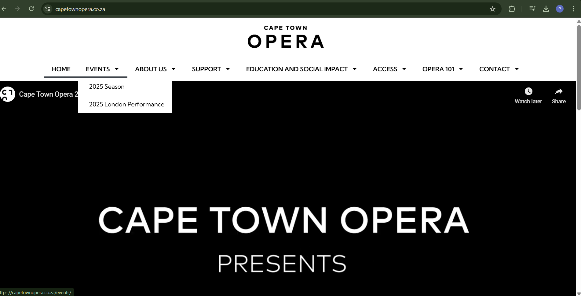
Clear Navigation: The main nav is simple and intuitive, making it easy to find info like upcoming shows and educational resources. I also like how the menu expands on hover—very user-friendly.
Visual Hierarchy: I like how the layout uses headings, subheadings, and sections well. It makes skimming through info quick and efficient.
Cons:
Cluttered Homepage: For a first-time visitor, the homepage can feel overwhelming. There’s a lot going on with videos, images, and a huge carousel. It creates some cognitive overload and I don’t really like that.
Too Corporate: The design feels a bit too corporate and doesn’t pop visually. It lacks some of the energy or excitement you’d expect from a performing arts site.
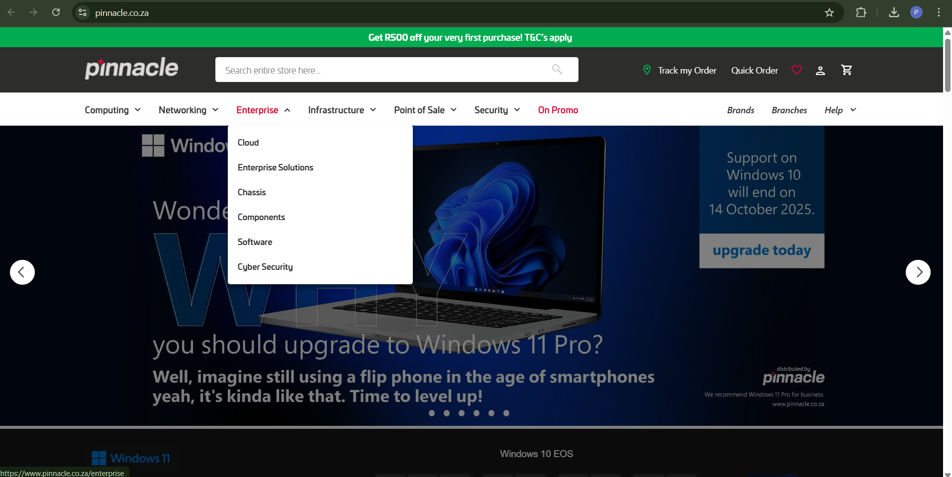
Clean & Minimalist Design: The site is sleek and professional. It has a solid brand identity and is visually appealing without being too much.
Simple Navigation: The navbar is clear, with sections like products, services, and news. Everything’s easy to access.
Effective Use of White Space: The layout feels open and breathable. I love how it doesn't feel crowded—really helps with readability and flow.
Nice Hover Effects: I really like the hover animations on buttons and links. Adds a nice interactive touch.
Cons:
Outdated Elements: While it's clean, some design parts like color schemes and button styles feel a bit dated. A visual refresh could modernize the site.
Text-Heavy Sections: There are blocks of text that just feel too long—kinda makes me want to scroll past instead of read.
Responsiveness Issues: Especially on the carousel, the text feels cramped and too close together on smaller screens. Could use some tweaking for better mobile experience.