Ethics, UI, UX & Interaction: A Case Study of Standard Bank South Africa's Digital Banking Platform on Desktop
Introduction
Over the past ten years, there has been a notable change in the digital landscape, which has shaped how people use websites and apps. In South Africa, where over 68% of people have access to the internet (Kemp, 2024), financial institutions have made significant investments in their online presence to satisfy consumer demands. With ethical considerations taking centre stage in design decisions, user interface (UI) and user experience (UX) design concepts have emerged as essential elements in producing successful digital interactions. In the context of financial services, where trust, accessibility, and security are paramount, ethical considerations in interaction design become even more critical.
In this essay, I will analyse the UI and UX of Standard Bank's website and examine the ethical design of its principles. As one of the "big four" banks in South Africa, Standard Bank offers a fascinating case study because it caters to a wide range of customers with different levels of digital literacy in a sectionerse and unequal economy like South Africa. To evaluate how well the website strikes a balance between user requirements and business objectives while considering ethical considerations specific to the South African context, the analysis will make use of known UI/UX concepts and ethical frameworks.
Context of Case Study
Standard Bank is a core component of our country's financial sector. It serves millions of customers across personal and business banking. Its website serves as a primary touchpoint for digital banking, offering services ranging from account management to loan applications. It operates within a complex South African context characterized by notable differences between urban and rural populations' access to the internet and level of digital literacy, as our country grapples with huge digital sectionides; only a certain percentage of the population has access to the internet (Gillwald et al., 2023). It is also characterized by its compliance with the Protection of Personal Information Act (POPIA) and other financial regulations.
The bank's website serves as both an informational platform and a gateway to its digital banking services, requiring a careful balance between security, usability, and inclusivity. This analysis focuses more on the desktop version of this website and evaluates through the lenses of UI/UX best practices and ethical frameworks and navigates these contextual factors through its design choices.
UI Analysis
Visual Design and Information Architecture
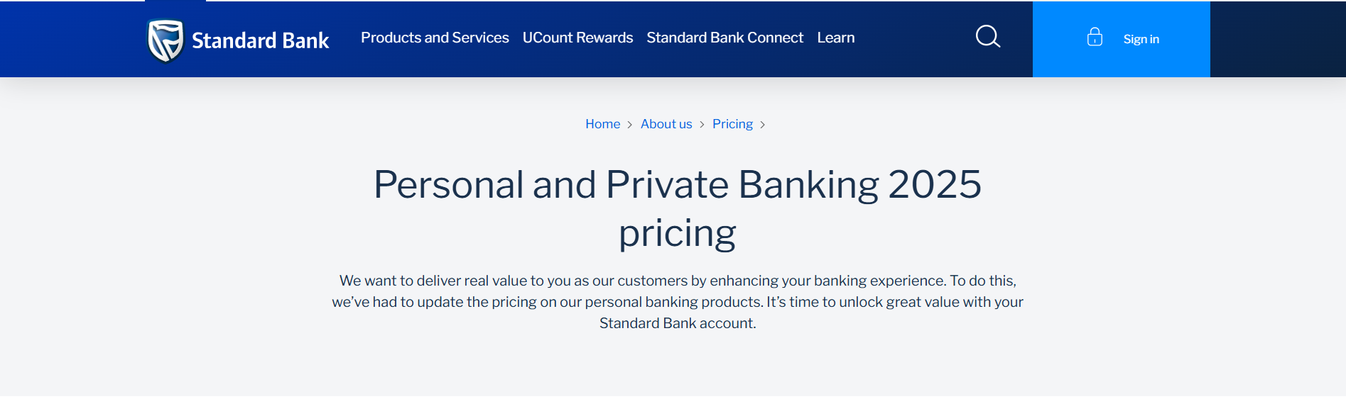
Standard Bank website uses a clean, professional aesthetic that is dominated by the brand's blue and white colour scheme, reflects its brand identity. The website displays an organized information structure with the main navigation at the top, promotional content in the middle and product categories arranged by user segments personal, business, etc.
Applying the Von Restorff Effect (Rafee, 2025), the website effectively uses visual contrast to highlight call-to-action (CTA) buttons. The "Sign In" button appears in a distinctive light blue against a darker blue background, making it immediately noticeable. This aligns with the principle that "when multiple similar objects are present, the one that differs from the rest is most likely to be remembered" (Rafee, 2025).

Hick's Law, which states that "the time it takes to make a decision increases with the number and complexity of choices," may be triggered by the homepage's abundance of options, which include banking products, promotions, tools, and resources (Rafee, 2025). Users may become overwhelmed by this cognitive overload, particularly those with low levels of computer literacy.
Navigation and Interaction Design
On content pages, the navigation system combines contextual sidebar navigation, dropdown sub-menus, and horizontal main menus. Users may become confused because of having to figure out various site navigation patterns, even while this offers multiple routes to content.
The website's button design complies with to Fitts' Law, which ensures that interactive elements are big enough and positioned appropriately for effortless selection. According to (Raffee, 2025), "Larger and closer targets are faster and easier to interact with." On a financial website, where selection accuracy is crucial, this is especially crucial.
Key Design Principles Applied
Touch targets must be big enough for precise selection, with sufficient distance between targets to avoid mistakes, and positioned in sections of the interface that are simple to reach, like those that fall within a user's thumb or cursor's natural range (Raffee, 2025). This is particularly important on a banking website where accuracy in selection is important and critical.
The website makes use of breadcrumb navigation and shows the user their progress for multiple processes, like applying for loans, etc., efficiently using the Zeignarik Effect, which explains that "People remember uncompleted or interrupted tasks better than completed tasks" (Raffee, 2025). Because users can see where they are in a process and what more they must complete, the design of this website helps and maintains engagement, and minimizes the rate of them abandoning the website.
Responsiveness & Accessibility
The standard bank website successfully presents responsive design principles, it adapts and responds across various screen sizes, including mobile and/or desktop screens, etc. There are however, inconsistencies when viewing using mobile screens; some elements become too small and thus difficult to interact with. This contradicts and violates Fitt's Law regarding spacing and target sizing which states that "The time to acquire a target is a function of the distance to and size of the target " (Raffee, 2025). Targets that are closer and larger can be interacted with more quickly.
It has some accessibility features, including alternative texts for images, although some images don't have that, which is insufficient for users that are blind. Some interactive elements, like buttons have low contrast for users with visual impairments like colour blindness. This brings up concerns, ethically in regards to inclusivity, especially in South Africa where banking services should be inclusive in accessibility to everyone including people with various disabilities.
Ethical Considerations in Interaction Design
Privacy & Data Ethics
A lot of user data is collected by Standard Bank's website, both explicitly through forms and secretly through cookies and other tracking technology. Although the website has cookie consent procedures and privacy statements, many users may not fully understand them because they are sometimes written in complex, legal terms. In a nation where many people have differing degrees of digital literacy, this calls into question informed consent.
Personal information has not remained personal, as our private information is widely available to large corporations. It is the UX designers' duties to make effective use of this knowledge.
— Ghanchi (2021)
The ethical problem attempts to strike a balance between the advantages of personalization and privacy preservation. The website shows a dedication to protecting customer data by utilizing security measures like encryptions and automated session timeouts. However, the high number of marketing consent choices in registration procedures raises the possibility of a conflict between user privacy and the company's objectives.
Persuasive Design and Dark Patterns
Subtle persuasive design components can be found by analysing the credit card and loan application processes; and the setting up of auto payments. Psychological concepts are used to influence user decisions through pre-selected options, a focus on benefits and advantages rather than costs, and urgency messages. These components pose moral concerns regarding the distribution of power between the organization and its clients, even when they are not outwardly-lying.
The boundary between white-hat persuasion and grey-hat or black-hat persuasion sometimes becomes obscured.
— Ghanchi (2021)
Though some attractive aspects may persuade consumers to make financial decisions without fully considering the repercussions, Standard Bank generally avoids the more troublesome dark patterns, such as forced continuity or hidden fees. You can find pop-ups that advertise pre-approved loans which in a way emphasize urgency to entice people to make quick decisions. Users could avoid Debt traps if the website is more transparent with in disclosing risks of debt.
Examples of Ethical Concerns
- Quick Invest Feature: Although the "Quick Invest" function makes buying financial goods easier, it does not provide contextual alerts about market dangers. Including required risk assessments would be in line with ethical design principles and enable well-informed decision-making.
- Cookie Consent: With the "Manage Preferences" link in low contrast grey, the cookie banner's default setting is "Accept All Cookies." This encourages users to give up data without giving their informed consent, which is against POPIA's mandate for "explicit, voluntary" opt-ins (POPIA, 2020).

Inclusivity and Accessibility
Providing services to the sectionerse population of South Africa presents special challenges for Standard Bank. Even though the country has eleven official languages, the website exclusively provides content in English. This raises serious ethical questions about inclusivity and accessibility since it could exclude non-native English speakers from equal access to financial services.
The website's performance optimization indicates that visitors with limited internet access are taken into consideration, which is a crucial ethical factor in South Africa where data costs are still high. Users can start reading while images load because pages load gradually, with text content coming before heavy media elements.
Ethical design involves avoiding all kinds of discriminatory messaging through your design solutions.
— Ghanchi (2021)
Although Standard Bank's marketing imagery depicts a variety of South African demographics, certain groups of people may be at a disadvantage due to the English-only content and complicated financial language.
Transparency and Trust
Users are entitled to know how their information is being used. To facilitate informed decision-making, UX designers should guarantee openness by presenting data collection, processing, and usage in plain terms (GeekforGeeks, 2024).
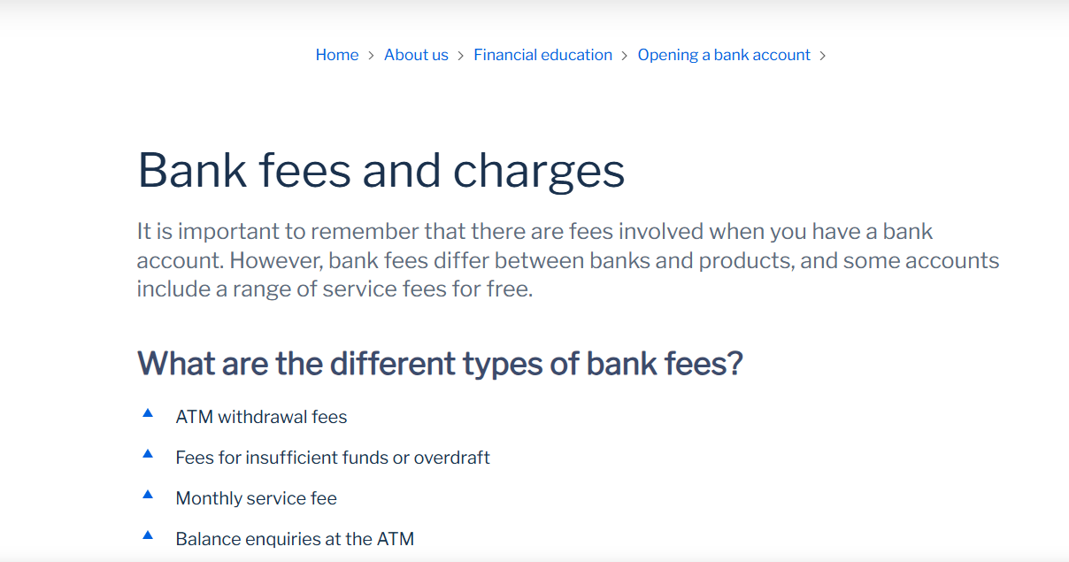
Because financial decisions have such large consequences, openness on financial websites needs special attention. Standard Bank helps consumers make educated decisions by offering calculators, comparison tools, and product information. Bank fees are occasionally displayed on secondary pages that require extra clicks to access; a design principle/decision that may compromise transparency.
It reflects what Ghanchi (2021) refers to as ethical design that respects users' time by giving feedback about background operations through the regular use of loading indicators and system status messages throughout interactive procedures. Gaining users' trust is facilitated by this system state transparency.
Recommendations for Ethical Improvement
To improve the ethics of the website, I would recommend they have more language options on the website, especially for important financial information and application processes. To guarantee full understanding and consent, the privacy notices and consent procedures should be rewritten using straightforward language and clear visual aids. Persuasion could also be balanced to make sure they educate rather than deceive users, especially when it comes to credit products. Accessibility could also be improved to be more inclusive and better assist all demographics and people with disabilities. Important details such as costs and conditions should be given the same visual attention as benefits and advantages.
Conclusion
The website of Standard Bank South Africa exemplifies the expert application of UI/UX principles while battling challenging ethical issues. For educated consumers, an effective interface is produced using psychological design principles such as Fitts' Law, the Von Restorff Effect, and the Zeigarnik Effect. But striking a balance between corporate goals and the demands of South Africa's varied population still presents ethical difficulties.
Balancing your professional goals and moral values when designing user experiences is what ethical design is all about.
— Ghanchi (2021)
Although Standard Bank has made progress in this complex balancing act, it could strengthen its ethical position even further by giving sectionersity, transparency, and honest informed consent greater attention.
This case study is a prime example of the tension between ethical responsibility and decent design. Although its UI/UX promotes usability, shortcomings in user control, transparency, and inclusivity highlight areas for improvement. Financial platforms like the Standard Bank website may create fair digital spaces and user-friendly interfaces by including ethical considerations into every design decision, from colour contrast to data consent. Ethical design is a moral requirement and about actively supporting fair accessibility and transparency at a time and country where technology influences financial well-being.