Portfolio Website Implementation Reflection
Introduction
Throughout the semester, developing my portfolio website to showcase projects, game design, writing, and academic essays presented both challenges and learning opportunities. This reflection examines how UI and UX decisions directly influenced my code implementation, highlighting areas of growth and technical evolution.
Folder Structure Analysis
Hierarchical Information Structure
My folder structure evolved to mirror the content hierarchy of the portfolio. The main sections (portfolio i.e game design and, writing & interactivity projects, essays) each received dedicated directories, creating intuitive navigation paths that users expect. This organization directly influenced my HTML structure, as the folder hierarchy naturally translated into logical navigation menus and breadcrumb systems.
Separation of Concerns
Initially, I struggled with properly separating the three core layers:
- Data Layer (HTML): Focused on semantic content structure
- Logic Layer (JavaScript): Handled interactive functionality
- Presentation Layer (CSS): Managed visual styling and layout
The most significant challenge was breaking my habit of inline styling and scripting. This separation became crucial when implementing consistent navigation across different sections, particularly when the essay page's navbar initially refused to match the universal styling.
Modularity and Scalability
Adopting consistent naming conventions and modular CSS classes seemed essential. As the website grew, having reusable components like .nav-item, .project-card, and .essay-header made expansion manageable and maintainable.
Semantic Markup Implementation
Browser Context and Information
My markup provides comprehensive context through proper use of semantic HTML elements. Each section uses appropriate tags (<article>, <section>, <header>, <nav>) that clearly communicate content purpose to browsers and assistive technologies.
Interface Elements Expression
Navigation elements utilize proper <nav> structures with lists and descriptive link text. Form elements include appropriate labels and field sets where needed. Interactive elements clearly indicate their purpose through semantic markup rather than relying solely on visual cues.
Content Expression
Projects in the portfolio and essay page use <article> elements with proper heading hierarchies (h1 through h3). Academic essays maintain scholarly structure through semantic markup that preserves the logical flow of arguments and citations.
Usability and Accessibility Enhancement
Semantic markup significantly improved:
- Screen reader navigation: Proper heading structures allow users to jump between sections
- Keyboard navigation: Logical tab order through semantic elements
- Search engine optimization: Clear content structure helps search engines understand the portfolio's organization
- Mobile accessibility: Semantic elements respond better to assistive technologies on mobile devices
Metadata Implementation
Browser Guidance
Meta tags provide essential information including viewport settings for responsive design, character encoding, and page descriptions. Each page includes specific metadata tailored to its content type (portfolio page vs. essay page & blogs page).
Content Requiring Metadata
Academic essays particularly benefit from metadata including:
- Publication dates
- Author information and academic credentials
- Subject classification and keywords
- Citations and metadata for academic integrity
Expression Quality
Project Card metadata ensure proper comprehension, while structured data helps search engines understand the portfolio's academic and professional content.
CSS Evolution
Eliminating Inline Styles
My biggest growth area involved transitioning from inline styles to properly organized CSS. The navbar consistency issue exemplified this challenge – inline styles were overriding my universal navigation CSS, creating visual inconsistencies across pages.
Modularity and Maintainability
Implementing CSS custom properties (CSS variables) for colours, fonts, and spacing created a maintainable design system. Component-based CSS classes allow for consistent styling while remaining flexible for different content types.
Responsive Design
CSS Grid and Flexbox layouts adapt seamlessly across devices. Media queries ensure that project galleries, essay layouts, and navigation remain functional and visually appealing on mobile, tablet, and desktop screens.
JavaScript Functionality
Event Handling and DOM Manipulation
JavaScript enhances user experience through:
- Interactive project galleries: Image lightbox for zooming and getting a closer to look at images in Essay posts; and filtering systems
- Progressive enhancement: Core content remains accessible without JavaScript
- Animations: Makes the website feel more alive
- Dynamic content loading: Essay abstracts expand/collapse for better readability
Code Consolidation
Repeated functionality like the footer, tag system for portfolio section, buttons, and navigation highlighting were consolidated into reusable functions. This reduced code duplication and improved maintainability.
External Scripting
Moving away from inline event handlers to external JavaScript files improved code organization and allowed for better debugging and performance optimization.
Contact Form Integration
I implemented a comprehensive contact form using Formspree as the API endpoint, allowing visitors to easily reach out with feedback. The form includes:
- Name field for personalization
- Email field for response capability
- Message textarea for detailed communication
- Form validation to ensure data quality before submission
- Success/error feedback to confirm form submission status
This provides a seamless way for visitors to connect without requiring server-side infrastructure.
Dynamic Color System Features
The color system includes several features:
- Mood-based presets: Curated color schemes for different user personas (Developer, Writer, Designer)
- Real-time application: Colors update instantly across the entire site using CSS custom properties
- Interactive swatches: Click-to-copy hex values for designer convenience
- Persistent state: Color changes remain active during the session
- Reset functionality: One-click return to original color scheme
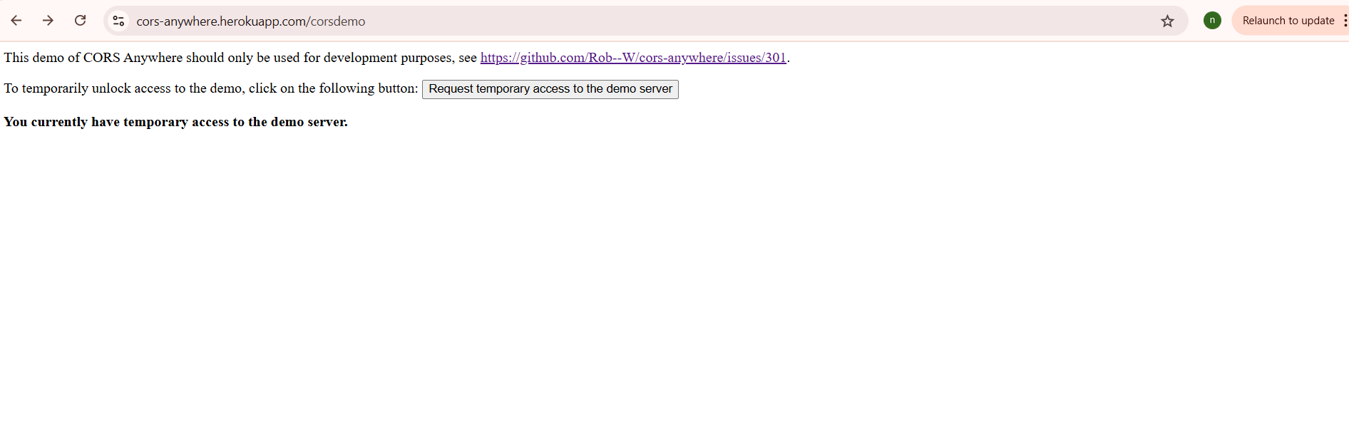
The script includes a CORS proxy for the API, but it seems I need to temporarily unlock access to the demo as shown in the screenshot below. Click this link: https://cors-anywhere.herokuapp.com/corsdemo to temporarily unlock access to see the API work. I did also add a fallback system that works offline.
User Experience Enhancements
The overlay popup dynamically updates its content based on:
- Selected mood (Developer or Writer themes)
- API-generated variations that maintain aesthetic consistency
- Loading states and error handling for smooth user interaction
- Toast notifications for user feedback
This feature demonstrates advanced JavaScript concepts including asynchronous API handling, DOM manipulation, CSS custom property management, and robust error handling - all while maintaining accessibility and progressive enhancement principles.
Asynchronous Requests
The website demonstrates several levels of asynchronous implementation, from fully realized features to planned future enhancements:
Current Implementations:
- Contact Form Submission - Fully asynchronous form handling with proper error management, timeout controls, and user feedback through loading states and success/error messages
- Dynamic Navigation Loading - Client-side generation of navigation menus that adapt based on page context without requiring server round trips
- Progressive Enhancement - Form validation and interaction patterns that gracefully handle network failures and provide immediate user feedback
- Real-time Portfolio Filtering - Asynchronous DOM manipulation with smooth transitions, opacity animations, and grid layout adjustments that respond to user interactions without page reloads
- Dynamic Component Initialization - Conditional loading and setup of interactive features (lightbox, reading progress, mobile touch handlers) based on page context and device capabilities
Technical Features Implemented:
- Fetch API with Abort Controller for request timeout management
- Promise-based error handling with specific network and timeout error types
- Loading state management with visual indicators during form submission
- Accessibility-focused async operations with proper ARIA attributes and focus management
Key Challenges and Solutions
Navigation Consistency Issue
The essay page navbar problem highlighted the importance of CSS specificity and the cascade. The solution involved:
- Removing all inline styles from the problematic page
- Ensuring consistent HTML structure across all pages
- Using CSS custom properties for consistent styling
- Implementing a single, comprehensive navigation stylesheet
Color Mood Generator - API Integration
One of the most challenging features was implementing the Color Mood Generator using the Colormind API. This dynamic system allows users to completely transform the website's color palette in real-time through an interactive overlay popup.
Technical Implementation Challenges
The Colormind API integration proved particularly complex, requiring multiple fallback strategies:
- Direct API calls to Colormind for optimal performance
- CORS proxy fallback when direct calls are blocked by browser security
- Seed color anchoring using curated palettes as generation guides
- Random palette generation for additional variety
- Local fallback variations when all API methods fail
Breaking Bad Habits
Transitioning from inline styling and scripting required conscious effort and systematic refactoring. This process improved code quality and made debugging significantly easier.
Impact on User Experience
The technical improvements directly enhanced UX through:
- Consistent navigation: Users can predict how to move through the portfolio
- Accessible content: Semantic markup ensures all users can access the content
- Performance optimization: Proper CSS and JavaScript organization improves load times
- Responsive design: Content adapts seamlessly across devices
- Professional presentation: Clean code translates to polished user experience
Conclusion
The development process of my portfolio website demonstrated how UI/UX decisions create cascading effects throughout the codebase. Proper folder structure, semantic markup, and separation of concerns not only improve code maintainability but directly enhance user experience. The challenges encountered, particularly with CSS consistency and breaking inline styling habits, provided valuable learning experiences that strengthened both technical skills and understanding of web development best practices.
Moving forward, the foundation established through proper implementation of these core principles creates a scalable platform for portfolio expansion and professional growth.